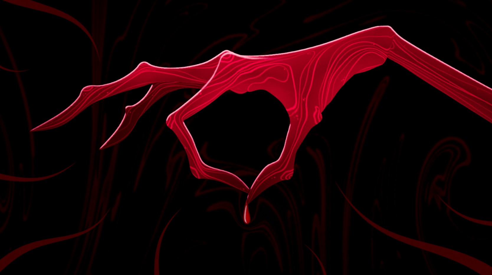

As a deadly disease threatens the survival of her community, the little girl must choose between fear and acceptance in a bid to save her people. Will she succeed?
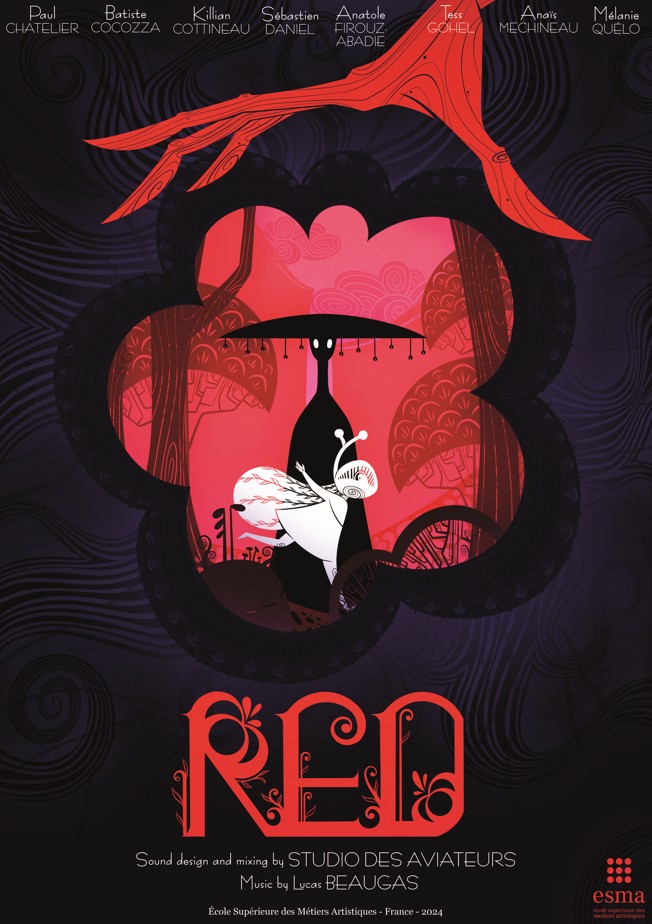
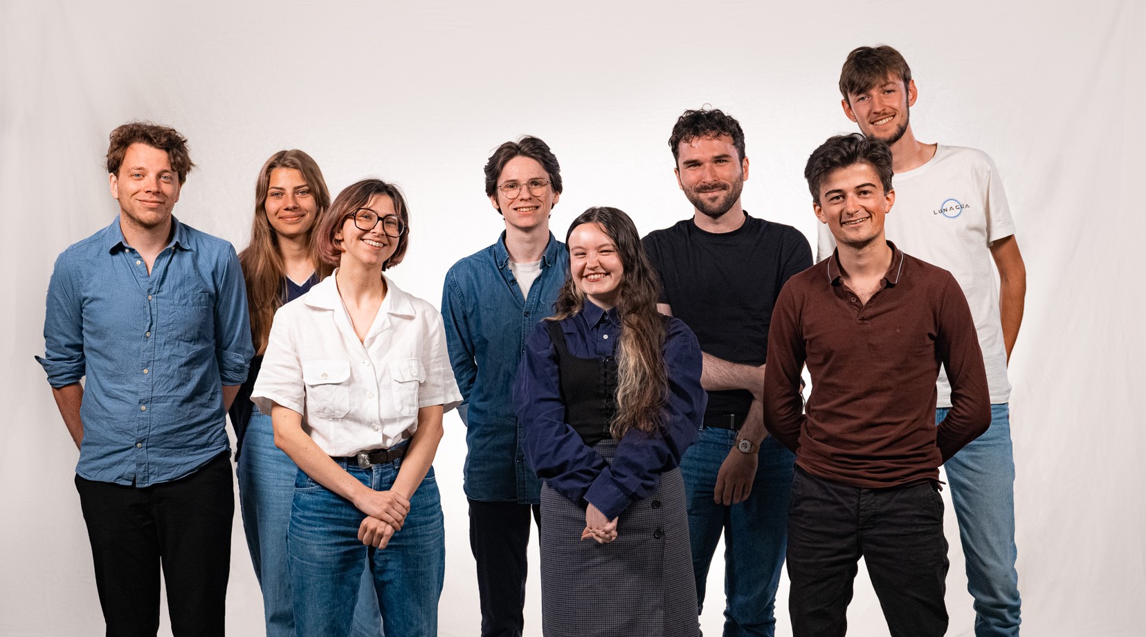
Without spoiling the ending, the film team(Paul Chatelier, Batiste Cocozza, Killian Cottineau, Sébastien Daniel, Anatole Firouz-Abadie, Tess Gohel, Anaïs Mechineau and Mélanie Quélo) have taken a rather daring approach, going against the grain of similar fables.
It’s a choice that makes the film’s subtext all the more powerful, where form and content come together to create a highly evocative result.
How did this production, which skilfully blends 2D rendering and 3D animation, come about? We invite you to take a look behind the scenes with the film’s teams.
Questioning our own failings
“At the very beginning of the project, there was a desire to deal with the fear of foreigners, to denounce it and show the consequences,” says Sébastien Daniel, speaking on behalf of the Red team. “That’s why we turned to storytelling, which carries a moral, with a poetic, colourful and theatrical staging.
A film without dialogue that gets to the heart of the matter, Red is a poetic and symbolic fable, inspired by the non-Manichaean narrative approach of Hayao Miyazaki’s films and exploring the profound themes of discrimination, xenophobia and their consequences. Red, the mysterious wanderer, represents the foreigner rejected by a society blinded by prejudice and fear.
“The initial idea was to build the film around the victim, but in the end we opted for the point of view of the aggressors through the eyes of little Nawe. The aim was to make viewers question their own behaviour.
Form and content combine to create an immersive, sensory experience
To support this strong message, the team chose an illustrative aesthetic, which proved to be the best way of expressing the message and their artistic intentions.
“We drew our inspiration from the work of many illustrators to build this universe.
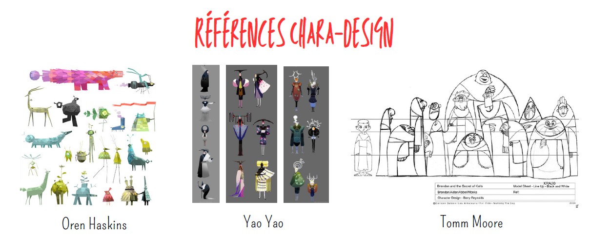
Tomm Moore’s dynamic, geometric characters were our main source of inspiration.
While her work (and that of Juliette Oberndorfer) on colours and their visual poetry, and the American artist Eyvind Earle (known for sublimating the sets and colours of Sleeping Beauty) for the design of the natural environments”.
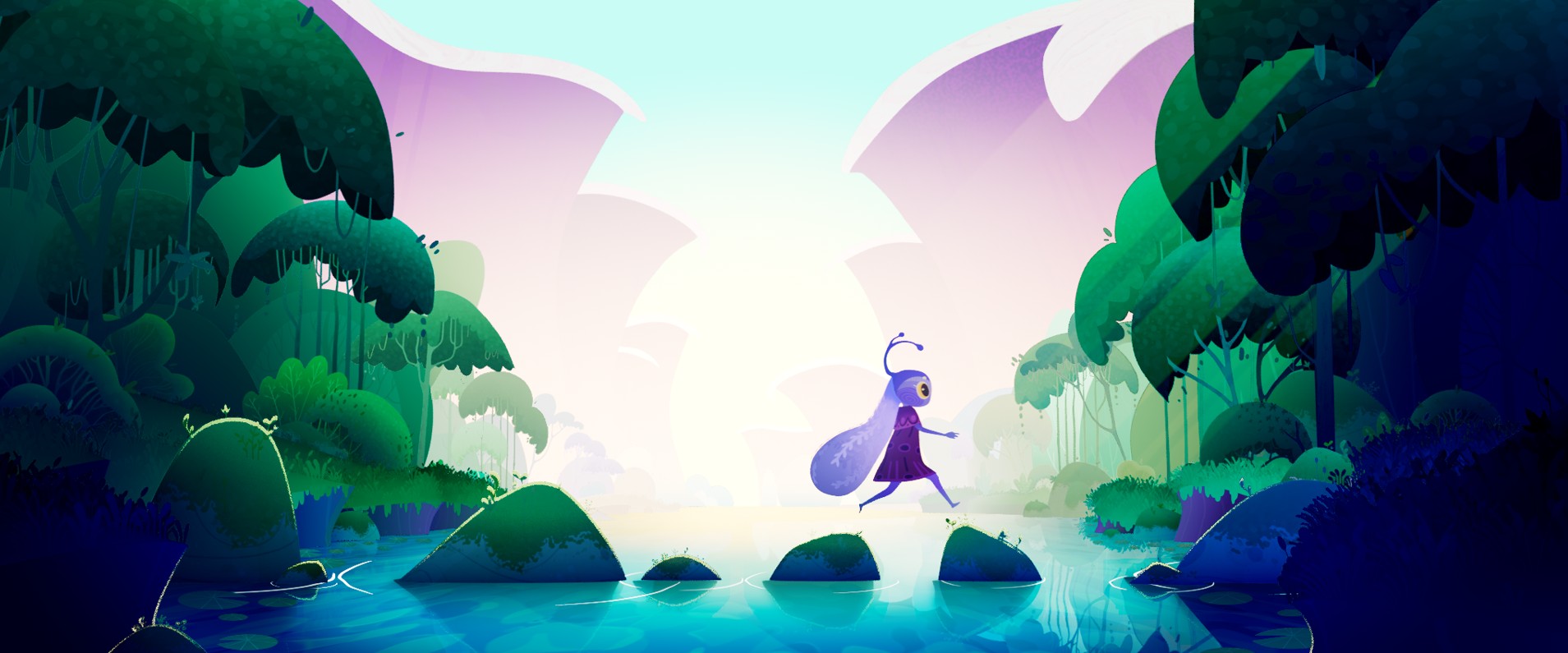
These influences are fully reflected in Red, and in the simple shapes of its characters, set against subtle, shimmering backdrops. Red the stranger adopts a sharp, triangular shape, in contrast to the round, gentle villagers. This contrast is also reflected in the colours, accentuating the dramatic irony that unfolds as the story unfolds.
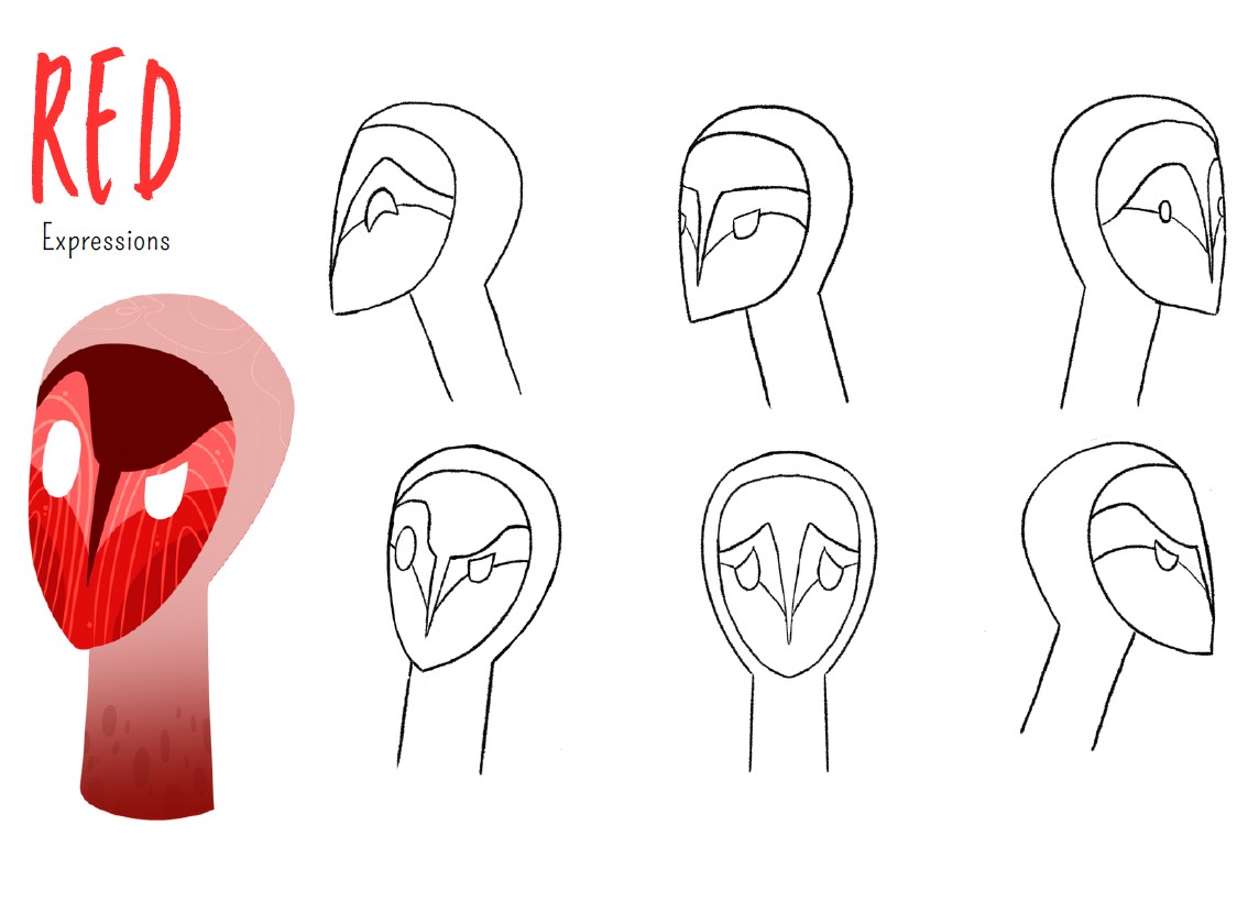
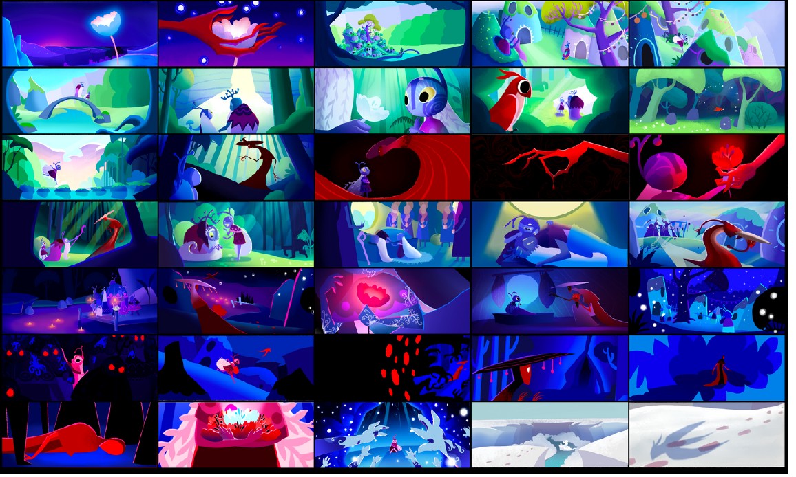
“The 2D treatment was essential to serve our intentions, with a strong focus on the composition and dynamism of the shots. Ambient colour plays a fundamental role: it reflects the emotional evolution of the characters, ranging from soft, soothing tones to more intense, anxiety-provoking hues. The blue of the villagers contributes to this feeling of closeness and trust, while red is associated with threat.
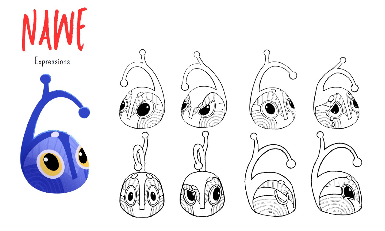
Finally, says the team, one of the greatest challenges of this project was to convey the emotions without a mouth or a voice.
It is through the shapes, the eyes and the staging that the expressiveness and depth of the characters are conveyed, as well as the issues at stake.
The result is both artistically powerful and thematically resonant with the misunderstanding and fear felt by the villagers. “Although they are stylised, the behaviour of our characters remains deeply human.”
A host of technical challenges
With its numerous sets, highly elaborate atmospheres and mix of animation techniques, Red is a complex project that forced its team to surpass themselves in order to achieve the technical and artistic quality they had set themselves, and the level expected of such a project.
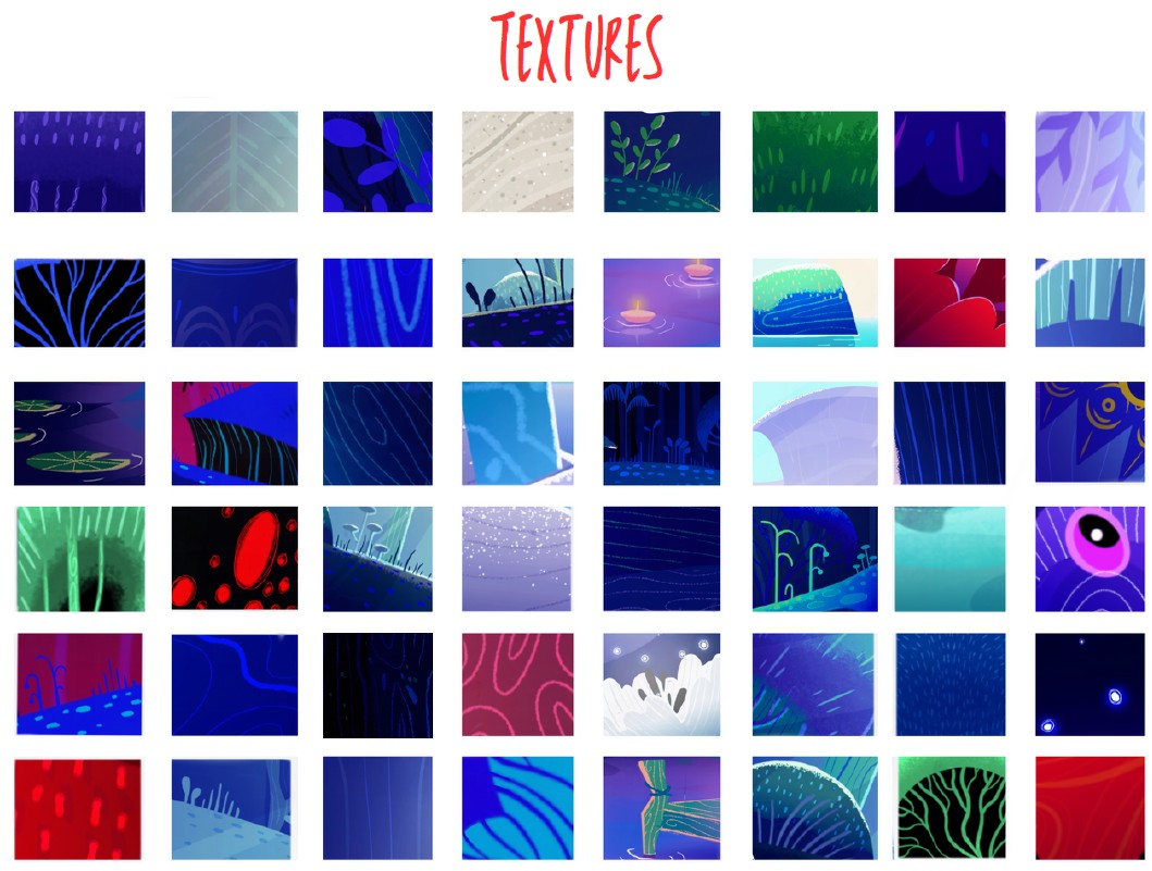
“The chosen graphic style created a number of constraints: rigorous organisation of the assets (with shot-by-shot staging); integration of 2D codes into a 3D pipeline; lighting treatment carried out entirely in Nuke; specific rigs for playing with graphic shapes and silhouette animation, etc. Not forgetting the abrupt transition of coloured moods between the different sequences, which was particularly difficult to manage while maintaining overall consistency.
In this film, where the characters are animated in 3D with variable framerates to accentuate the dramatic effect (in particular the contrast between the sick villagers and Red, who is always fluid at 24 frames per second), the successful combination of 2D and 3D in the mise-en-scène creates a dynamic visual transition that accompanies the rise in violence and dramatic tension. At the same time, it represents a major technical challenge.
To meet these multiple challenges, the team developed an asset manager to organise and manage the elements and characters efficiently, as well as a semi-automated pipeline on Nuke to guarantee the unity of the graphic processing.
At the same time, the character rigs were designed to offer maximum shape flexibility, which enabled the teams to facilitate the construction of the silhouettes and achieve the project’s high level of animation.
A rigorous methodology and an efficient division of labour to bring this ambitious project to fruition.
“We put in place a highly organised pre-production phase, with certain tasks automated and others integrated into a rigorous schedule to optimise production. Our roles were defined according to our respective specialities, between animation and light-rendering. These roles were supplemented by personal skills such as storyboarding, modelling and 2D FX. Even so, we lost a lot of work due to technical problems with storage. But it was our solid organisation that enabled us to bounce back and carry on serenely.”
“Showing your film in a cinema is a real accolade!
By overcoming these obstacles, the team delivered a student animated short that in some respects has nothing to envy of a professional production. “We achieved our objective: to convey our intentions in a poetic way with a strong aesthetic. We were deeply moved by the very positive feedback we received from the public, and the first screening of our film in a cinema was a real highlight. It was a real consecration! With more time, we could have refined certain aspects. But despite the constraints, we’re satisfied with the result.”
What advice do these students have for those now working on their own films? “Patience is a virtue, communication a necessity,” sums up Sébastien Daniel on behalf of his team. “And, as a bonus, cookie breaks as a way of building cohesion! The recipe for a successful end-of-studies animated film, the fruit of a high-level collaborative effort.
Discover RED, ESMA’s 2024 graduation film, now available in full: